Bar Charts Matplotlib
In this class, We discuss Bar Charts Matplotlib.
For Complete YouTube Video: Click Here
The reader should have prior knowledge of groupby and multi-index in the data frame. Click here.
The data set we considered in this class is discussed in our previous class.
Based on the assumption reader is aware of the data and multi-index in the data frame. We explain about bar charts.
Bar Charts
A Bar Chart consists of rectangular boxes that help to visualize the categorical data.
Take an example and understand how to construct bar charts in python matplotlib.
Example: Construct a bar chart for the region-wise total sale.
First, we have to use the groupby method and identify region-wise total sales in our sample store data.
The discussion about the data set and groupby method is made in our previous classes.
We do groupby on region and take the total sale.
The module matplotlib. pyplot contains all the methods to construct graphs. Click here.
The figure method is used to construct a figure.
The arguments 18,5 are the size of the figure. We can change the size of the figure based on the requirement.
To construct a bar chart, we use the method bar.
The bar method parameters are x-axis values and y-axis values.
The x-axis is a region in our example. We took the region values in a variable x.
The y axis is a total sale in our example. We took total sales in a variable y.
The parameter color is used to mention the color of the bar.
Bar width can be changed using the width parameter.
import pandas as pd
df=pd.read_excel('sampledata.xls',sheet_name='Orders')
print(df.head())

# Taking the sum of the sale group wise
temp=pd.DataFrame(df.groupby(['Region'])['Sales'].agg('sum'))
print(temp)
x=temp.index
y=temp['Sales'].values
print(x)

Output:
               Sales
Region
Central  501239.8908
East     678781.2400
South    391721.9050
West     725457.8245
Index(['Central', 'East', 'South', 'West'], dtype='object', name='Region')

import matplotlib.pyplot as plt
z=plt.figure(figsize=(18,5))
plt.bar(x, y, color ='blue',width = 0.4)
plt.show()
xlabel ylabel and title Methods
The bar chart shown above does not have labels and titles.
Without labels and titles, we get confusion.
To add labels and titles, we use the methods xlabel, ylabel, and title.
The example code is given below.
import matplotlib.pyplot as plt
z=plt.figure(figsize=(18,5))
plt.bar(x, y, color ='blue',width = 0.2)
plt.xlabel("Region")
plt.ylabel("Sum of sale")
plt.title("Region Wise Total Sale")
plt.show()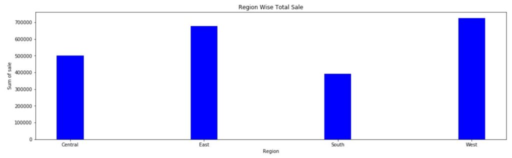
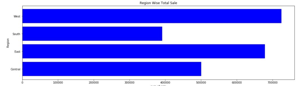
Horizontal Bar Chart
The above bar charts we call vertical bar charts.
We can generate the horizontal bar charts by using the method barh.
The remaining parameters we discussed above are the same for the method barh.
# Horizontal Bar chart
import matplotlib.pyplot as plt
z=plt.figure(figsize=(18,5))
plt.barh(x, y, color ='blue')
plt.xlabel("sum of sale")
plt.ylabel("Region")
plt.title("Region Wise Total Sale")
plt.show()