Changing Coordinate Axis Units Matplotlib
In this class, We discuss Changing Coordinate Axis Units Matplotlib.
For Complete YouTube Video: Click Here
The reader should have prior knowledge of line charts. Click here.
In our last class, we have discussed line charts.
The readability of the line chart is not proper. Because large units are taken in the y-axis.
We need to change the axis units. Below the code is a multiple-line plot from our previous class.
import pandas as pd
df=pd.read_excel('sampledata.xls',sheet_name='Orders')
print(df.head())

df['year'] = df['Order Date'].dt.year
print(df.head())

# grouping sales year wise
temp=pd.DataFrame(df.groupby(['year'])['Sales'].agg('sum'))
print(temp)
x=temp.index
y=temp['Sales'].values
print(x)

# plot Multiple lines
# we are taking furniture sale year wise to plot
temp1=pd.DataFrame(df.groupby(['year','Category'])['Sales'].agg('sum'))
print(temp1)
x1=temp1.index
print(x1)

temp2=temp1.xs('Furniture', level='Category')
temp3=temp1.xs('Office Supplies', level='Category')
temp4=temp1.xs('Technology', level='Category')
y1=temp2['Sales'].values
y2=temp3['Sales'].values
y3=temp4['Sales'].values
print(y1)
print(y2)
print(y3)

# Multiple line plot code
import matplotlib.pyplot as plt
z=plt.figure(num=1,figsize=(10,5))
plt.plot(x, y1, color ='blue')
plt.plot(x,y2,color='red')
plt.plot(x,y3,color='green')
plt.xticks(x)
plt.xlabel("Year")
plt.ylabel("Sum of sale")
plt.title("Year Wise Total Sale")
plt.show()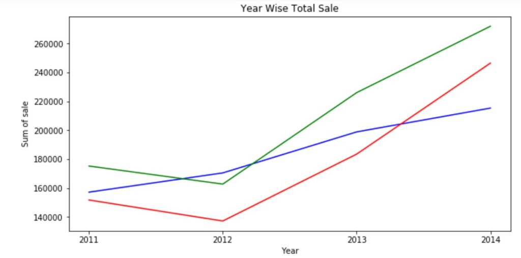
Changing Coordinate Axis Units
ylim method to change y-axis limits
The below program uses ylim method to change the limitation of the y-axis.
# change y coordinate units using ylim
# Multiple line plot code
import matplotlib.pyplot as plt
z=plt.figure(num=1,figsize=(10,5))
plt.plot(x, y1, color ='blue')
plt.plot(x,y2,color='red')
plt.plot(x,y3,color='green')
plt.ylim(-260000,260000)
plt.xticks(x)
plt.xlabel("Year")
plt.ylabel("Sum of sale")
plt.title("Year Wise Total Sale")
plt.legend(['Furniture','Office Supplies','Technology'],loc=0)
plt.show()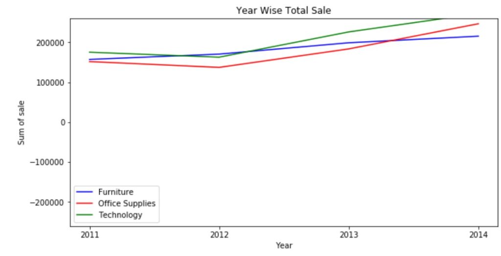
Change Units on Y-axis
We use the method yticks to change the unit measure on the y-axis.
In the same way, we can change the x-axis using xticks.
We used the arrange function to generate the y-axis units that are to be displayed.
The below code shows us how to change the y-axis unit measure.
# changing Unit measure using yticks
import matplotlib.pyplot as plt
import numpy as np
z=plt.figure(num=1,figsize=(10,5))
plt.plot(x, y1, color ='blue')
plt.plot(x,y2,color='red')
plt.plot(x,y3,color='green')
plt.xticks(x)
plt.yticks(np.arange(130000,280000,10000))
plt.xlabel("Year")
plt.ylabel("Sum of sale")
plt.title("Year Wise Total Sale")
plt.legend(['Furniture','Office Supplies','Technology'],loc=0)
plt.show()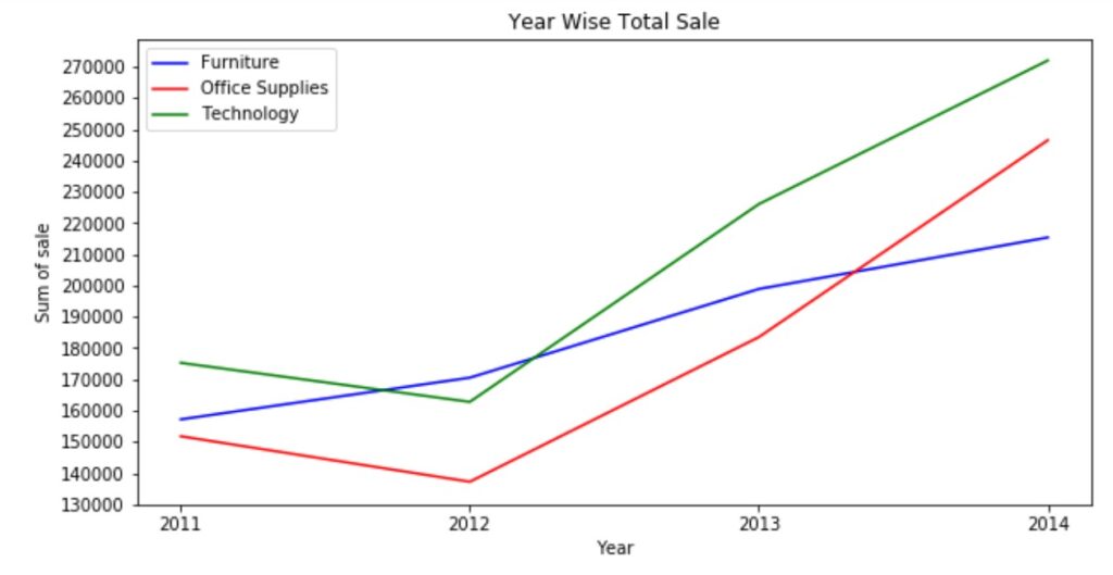
The output of the above code still does not have the clarity to check the data values in the line graph.
We can use grid style for better readability of graphs.
We can apply markers to have better readability of the graph.
Below is the code to give better clarity using grid style and markers.
# more clarity using markers and Grid
import matplotlib.pyplot as plt
import numpy as np
z=plt.figure(num=1,figsize=(10,5))
plt.plot(x, y1,'b-o')
plt.plot(x,y2,'r:s')
plt.plot(x,y3,'g--d')
plt.grid(True)
plt.xticks(x)
plt.yticks(np.arange(130000,280000,10000))
plt.xlabel("Year")
plt.ylabel("Sum of sale")
plt.title("Year Wise Total Sale")
plt.legend(['Furniture','Office Supplies','Technology'],loc=0)
plt.show()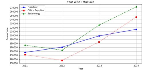
We use the method grid to generate grid lines.