Combining Bar and Line Charts
In this class, We discuss Combining Bar and Line Charts.
For Complete YouTube Video: Click Here
The reader should have prior knowledge of line and bar charts. Click here.
We use the legend and yticks methods, which are discussed in our previous classes.
When do we need a combination of line and bar charts?
Take an example from our superstore data set.
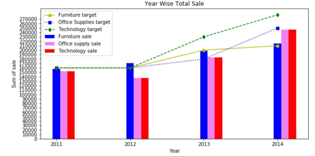
The example we chose to display bar charts for the total sale of each category.
We have three categories. Furniture, office supplies, and technology.
If your manager has given some targets for each category?
Then these targets are taken as line plots, and sales are taken as bar charts.
By looking at the combination of bar and line graphs, we have an idea of targets reached or not.
chart of targets
Below is complete code to take the total sale of categories and line chart of targets
import pandas as pd
df=pd.read_excel('sampledata.xls',sheet_name='Orders')
print(df.head())

df['year'] = df['Order Date'].dt.year
print(df.head())

# grouping sales year wise
temp=pd.DataFrame(df.groupby(['year'])['Sales'].agg('sum'))
print(temp)
x=temp.index
y=temp['Sales'].values
print(x)

# plot Multiple lines
# we are taking furniture sale year wise to plot
temp1=pd.DataFrame(df.groupby(['year','Category'])['Sales'].agg('sum'))
print(temp1)
x1=temp1.index
print(x1)

temp2=temp1.xs('Furniture', level='Category')
temp3=temp1.xs('Office Supplies', level='Category')
temp4=temp1.xs('Technology', level='Category')
y1=temp2['Sales'].values
y2=temp3['Sales'].values
y3=temp4['Sales'].values
print(y1)
print(y2)
print(y3)

import matplotlib.pyplot as plt
import numpy as np
z=plt.figure(num=1,figsize=(10,5))
yt1=[160000,160000,200000,210000]
yt2=[160000,160000,180000,250000]
yt3=[160000,160000,230000,280000]
k1=np.arange(len(x))
plt.bar(k1,y1,color='blue',width=0.1)
plt.bar(k1+0.1,y2,color='violet',width=0.1)
plt.bar(k1+0.2,y2,color='red',width=0.1)
plt.plot(k1, yt1,'y-o')
plt.plot(k1,yt2,'b:s')
plt.plot(k1,yt3,'g--d')
plt.xticks(k1,x)
plt.yticks(np.arange(0,280000,10000))
plt.xlabel("Year")
plt.ylabel("Sum of sale")
plt.title("Year Wise Total Sale")
plt.legend(['Furniture target','Office Supplies target','Technology target','Furniture sale','Office supply sale','Technology sale'],loc=0)
plt.show()