Bubble Chart Plotly
In this class, We discuss bubble chart plotly.
For Complete YouTube Video: Click Here
Bubble Chart
The reader should have prior knowledge of the Scatter plot. Click here.
The bubble chart is similar to the scatter plot. We use a scatter plot to identify the relation between two variables.
Similarly, a bubble chart is used to identify the relation between two variables. But gives better visualization options.
We use the same example from the scatter plot class.
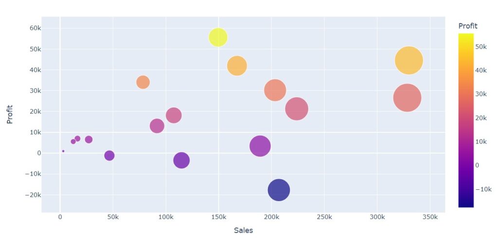
The columns sales and profits are used to construct the bubble chart.
The below example shows the program to construct a bubble chart.
import pandas as pd
df=pd.read_excel('sampledata.xls',sheet_name='Orders')
print(df.head())

temp=pd.DataFrame(df.groupby(['Sub-Category']).agg({'Sales':'sum','Profit':'sum'}))
print(temp)

import plotly.express as px
fig = px.scatter(temp, x="Sales", y="Profit",
	         size="Sales", color="Profit",
                 hover_name=temp.index,size_max=40)
fig.show()
We use the module plotly.express to construct a bubble chart.
The function scatter is used to construct a bubble chart.
The size parameter is used to change the sizes of bubbles according to the values.
The large value is given a large bubble size.
The color parameter is used to assign colors to the bubbles. The color mapping is shown right to the bubble chart.
The size_max parameter mentions the maximum size of the bubble.
The hover name is given subcategories. Whenever we place the cursor on the bubble, the hover name is displayed.
log_x Parameter
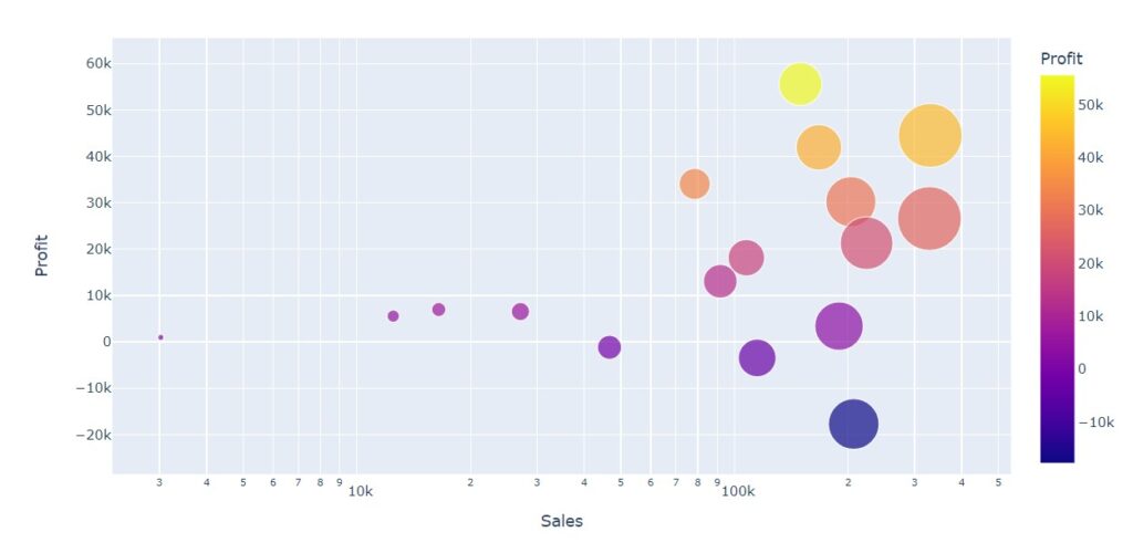
The parameter log_x is used to convert the x-axis values using log.
The below example shows the program using log_x parameter.
#log_x parameter
import plotly.express as px
fig = px.scatter(temp, x="Sales", y="Profit",
	         size="Sales", color="Profit",
                 hover_name=temp.index,size_max=40,log_x=True)
fig.show()
