Histogram Matplotlib
In this class, We discuss Histogram Matplotlib.
For Complete YouTube Video: Click Here
The reader should have prior knowledge of the superstore data set. Click here.
Histogram
Histogram charts are used to identify the frequency or count of a variable.
From the superstore data set, we are taking the frequency of quantity.
The customer bought two items, three items, etc. The quantity column gives the number of items bought.
The histogram is constructed on the quantity value. The program is given below.
import pandas as pd
df=pd.read_excel('sampledata.xls',sheet_name='Orders')
print(df.head())

x=df['Quantity'].values

# Simple histogram plot
import matplotlib.pyplot as plt
z=plt.figure(num=1,figsize=(5,5))
plt.hist(x,color ='blue',bins=13)
plt.xlabel("Quantity ")
plt.ylabel("Count of each quantity")
plt.title("Histogram on Quantity")
plt.show()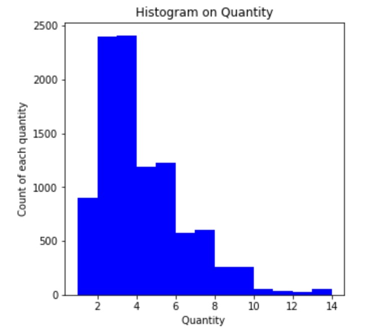
To construct the histogram, we use the function hist.
The x-axis shows the quantity values in the above example, and the y axis shows the count.
The parameter bins will mention the number of bins.
In the example above, we used 13 bins.
The bin positions are given according to the data.
Suppose the user wants to mention the bin positions with his requirement. We use parameter bins.
The list of bin positions is given as an argument to the bins parameter.
Bins Mentioned
The bins are taken 0-2 one bin and 2-4 another bin and so on.
The below program gives the user-defined bins.
# Simple histogram plot with bins mentioned
import matplotlib.pyplot as plt
z=plt.figure(num=1,figsize=(5,5))
plt.hist(x,color ='blue',bins=[0,2,4,6,8,10,12,14])
plt.xlabel("Quantity ")
plt.ylabel("Count of each quantity")
plt.title("Histogram on Quantity")
plt.show()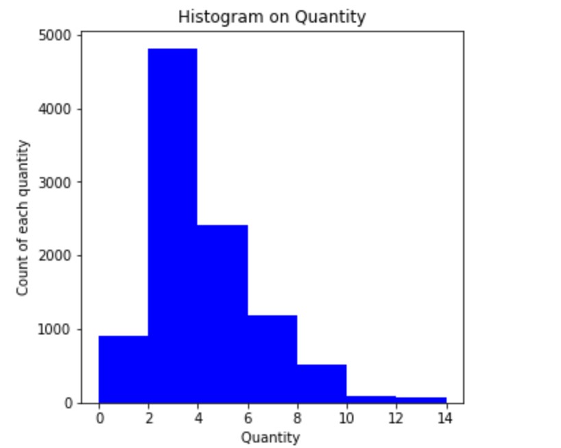
Probability Scores
Instead of the count, we can use a probability score on the y-axis.
The parameter density is used to display the probability scores on the y-axis.
The program to display the probability score is given below.
# Simple histogram plot with bins mentioned and probability scores
import matplotlib.pyplot as plt
z=plt.figure(num=1,figsize=(5,5))
plt.hist(x,color ='blue',bins=[0,2,4,6,8,10,12,14],density=True)
plt.xlabel("Quantity ")
plt.ylabel("Count of each quantity")
plt.title("Histogram on Quantity")
plt.show()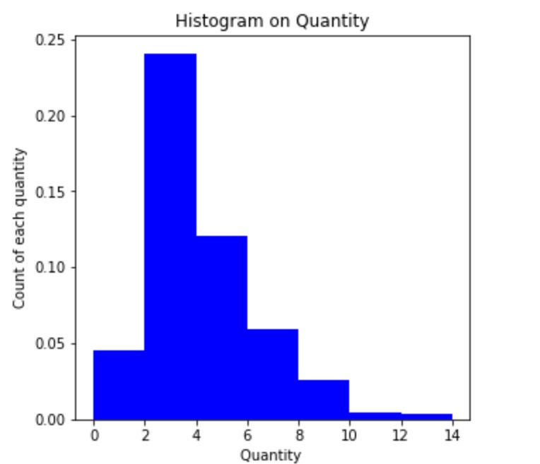
Probability is calculated count divide by total. Total is the sum of the count of all bins.
Step Type in Histogram
To show the step type histogram, we use the parameter histtype = step.
The program showing step type is given below.
# Simple histogram plot step type
import matplotlib.pyplot as plt
z=plt.figure(num=1,figsize=(5,5))
plt.hist(x,color ='blue',bins=[0,2,4,6,8,10,12,14],density=True,histtype='step')
plt.xlabel("Quantity ")
plt.ylabel("Count of each quantity")
plt.title("Histogram on Quantity")
plt.show()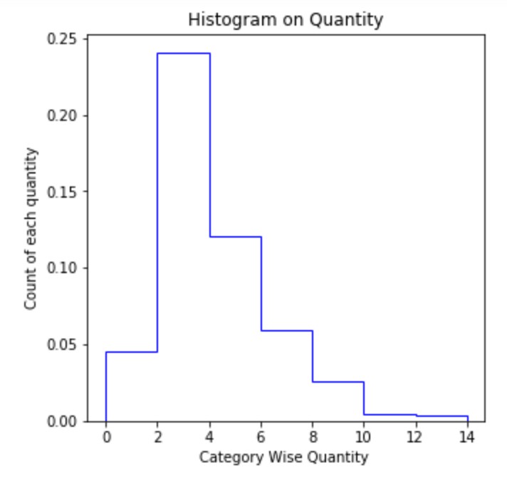
Stacked histogram side-by-side
To construct the side-by-side histogram. We take quantity according to category.
In the category, we have furniture, office supplies, and Technology.
To construct the multiple values histogram. We need to provide the list of values.
The below program shows the multiple histograms.
# different categories
temp1=df.loc[df['Category']=='Furniture']
x1=temp1['Quantity'].values
print(x1.shape)

temp1=df.loc[df['Category']=='Office Supplies']
x2=temp1['Quantity'].values
print(x2.shape)

temp1=df.loc[df['Category']=='Technology']
x3=temp1['Quantity'].values
print(x3.shape)

print(df.shape)

# Stacked histogram plot with bins mentioned
import matplotlib.pyplot as plt
z=plt.figure(num=1,figsize=(5,5))
plt.hist([x1,x2,x3],bins=[0,2,4,6,8,10,12,14])
plt.xlabel("Category Wise Quantity ")
plt.ylabel("Count of each quantity")
plt.title("Histogram on Quantity")
plt.legend(['Furniture','Office Supplies','Technology'])
plt.show()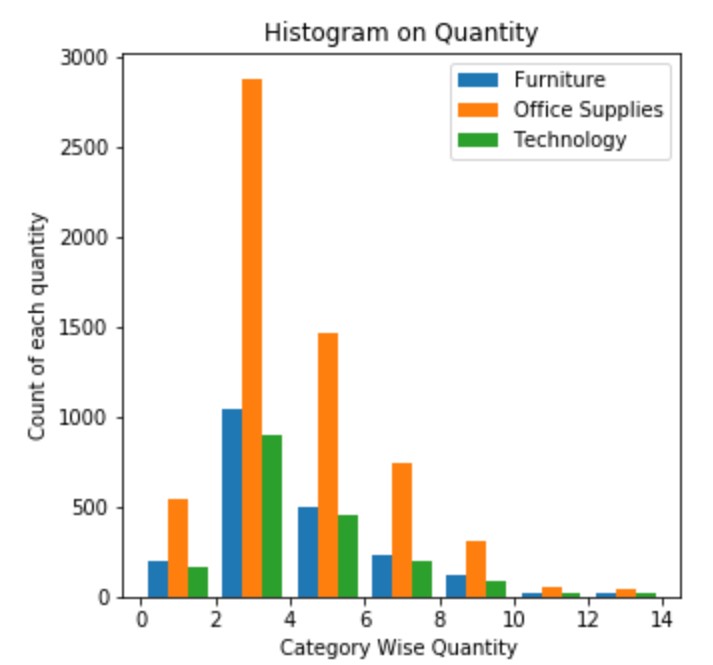
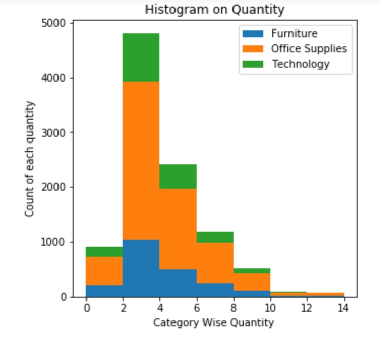
Stacked Histogram One above Another
We use the parameter stacked to construct a stacked histogram
stacked = True will construct stacked histograms.
The below program gives the example of constructing stacked histograms.
# Stacked histogram plot with bins mentioned
import matplotlib.pyplot as plt
z=plt.figure(num=1,figsize=(5,5))
plt.hist([x1,x2,x3],bins=[0,2,4,6,8,10,12,14],stacked=True)
plt.xlabel("Category Wise Quantity ")
plt.ylabel("Count of each quantity")
plt.title("Histogram on Quantity")
plt.legend(['Furniture','Office Supplies','Technology'])
plt.show()