Major and Minor Ticks in Matplotlib
In this class, We discuss Major and Minor Ticks in Matplotlib.
For Complete YouTube Video: Click Here
The reader should have prior knowledge of Line charts. Click here.
In our previous class, We discuss line charts.
To get better readability of the line charts, we use a grid layout.
We get even better readability by using major and minor ticks. For better understanding, please follow the complete course.
Major and Minor Ticks in Matplotlib
To set the major and minor ticks we use the method ax.xaxis.set_major_locator(MultipleLocator(10)) from axes object.
The discussion on axes object made in figure and subplot class. Click here.
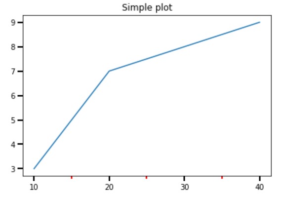
The complete code to set major and minor ticks and the ticks modification is given below.
# major and minor ticks
import matplotlib.pyplot as plt
import numpy as np
from matplotlib.ticker import (MultipleLocator, AutoMinorLocator)

t = [10,20,30,40]
s1 = [3,7,8,9]
s2 = [2,4,7,6]

fig, ax = plt.subplots()
ax.plot(t, s1)
ax.set_title('Simple plot')

ax.xaxis.set_major_locator(MultipleLocator(10))
ax.xaxis.set_minor_locator(MultipleLocator(5))

ax.tick_params(which='both', width=2)
ax.tick_params(which='major', length=7)
ax.tick_params(which='minor', length=4, color='r')
plt.show()
We can change the tick length and width using the method tick_params from the axes object.
The parameter ‘which’ is used to mention major and minor, and both.
We can assign different colours to major and minor ticks using a colour parameter.
Gridlines for Major and Minor Ticks
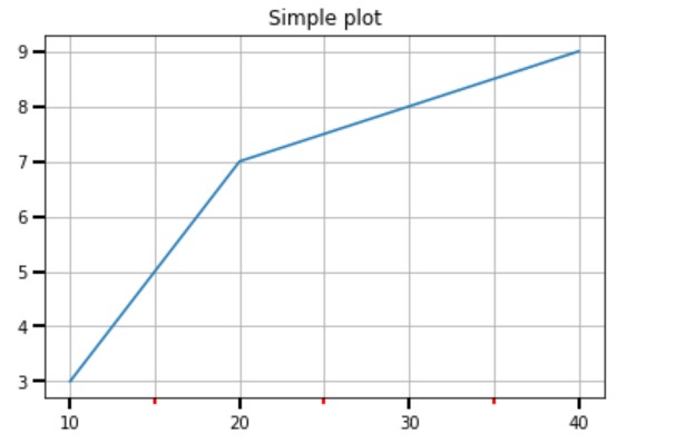
To provide grid lines for both major and minor ticks. we use the parameter in the grid method.
Both grid lines are taken in the below program.
# grid line to both major and minor
import matplotlib.pyplot as plt
import numpy as np
from matplotlib.ticker import (MultipleLocator, AutoMinorLocator)

t = [10,20,30,40]
s1 = [3,7,8,9]
s2 = [2,4,7,6]

fig, ax = plt.subplots()
ax.plot(t, s1)
ax.set_title('Simple plot')

ax.xaxis.set_major_locator(MultipleLocator(10))
ax.xaxis.set_minor_locator(MultipleLocator(5))

ax.tick_params(which='both', width=2)
ax.tick_params(which='major', length=7)
ax.tick_params(which='minor', length=4, color='r')
plt.grid(b=True,which='both')
plt.show()
Separate Color to Major and Minor Grid Lines
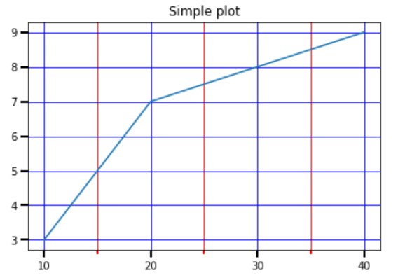
The separate colour is given using the colour parameter and which = major.
A separate call to the function grid to give different colours.
The separation is shown in the below program.
# different colors to major and minor grid lines
import matplotlib.pyplot as plt
import numpy as np
from matplotlib.ticker import (MultipleLocator, AutoMinorLocator)

t = [10,20,30,40]
s1 = [3,7,8,9]
s2 = [2,4,7,6]

fig, ax = plt.subplots()
ax.plot(t, s1)
ax.set_title('Simple plot')

ax.xaxis.set_major_locator(MultipleLocator(10))
ax.xaxis.set_minor_locator(MultipleLocator(5))

ax.tick_params(which='both', width=2)
ax.tick_params(which='major', length=7)
ax.tick_params(which='minor', length=4, color='r')
plt.grid(b=True,which='major',color='b')
plt.grid(b=True,which='minor',color='r')
plt.show()
Line Chart Example from Superstore Data set
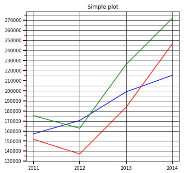
The line chart example considered in our previous class is considered here and shown with major and minor gridlines for better readability.
In the given code, we are not bothered about the beautification of the graph.
The reader has to choose the best colours for beautification.
The complete code on the superstore data set is given below.
# line chart eample
import pandas as pd
df=pd.read_excel('sampledata.xls',sheet_name='Orders')
print(df.head())

df['year'] = df['Order Date'].dt.year
print(df.head())

# grouping sales year wise
temp=pd.DataFrame(df.groupby(['year'])['Sales'].agg('sum'))
print(temp)
x=temp.index
y=temp['Sales'].values
print(x)

# plot Multiple lines
# we are taking furniture sale year wise to plot
temp1=pd.DataFrame(df.groupby(['year','Category'])['Sales'].agg('sum'))
print(temp1)
x1=temp1.index
print(x1)

temp2=temp1.xs('Furniture', level='Category')
temp3=temp1.xs('Office Supplies', level='Category')
temp4=temp1.xs('Technology', level='Category')
y1=temp2['Sales'].values
y2=temp3['Sales'].values
y3=temp4['Sales'].values
print(y1)
print(y2)
print(y3)

# different colors to major and minor grid lines
import matplotlib.pyplot as plt
import numpy as np
from matplotlib.ticker import (MultipleLocator, AutoMinorLocator)

t = [10,20,30,40]
s1 = [3,7,8,9]
s2 = [2,4,7,6]

fig, ax = plt.subplots()
fig.set_figheight(6)
ax.plot(x, y1, color ='blue')
ax.plot(x,y2,color='red')
ax.plot(x,y3,color='green')

plt.xticks(x)
plt.yticks(np.arange(130000,280000,10000))

ax.set_title('Simple plot')

#ax.yaxis.set_major_locator(MultipleLocator(10000))
ax.yaxis.set_minor_locator(MultipleLocator(5000))

ax.tick_params(which='both', width=2)
ax.tick_params(which='major', length=7)
ax.tick_params(which='minor', length=4, color='r')
plt.grid(b=True,which='major',color='black')
plt.grid(b=True,which='minor',color='grey')
plt.show()
