Pie Chart Matplotlib
In this class, We discuss pie chart matplotlib.
For Complete YouTube Video: Click Here
Pie Chart
The reader can follow our complete python for data science. Click here.
A pie chart is used to show the proportions or percentage of a variable using the circle.
Take an example and understand the pie chart.
The below example shows the program to construct a pie chart.
import matplotlib.pyplot as plt
departments=['CSE','ECE','MECH','CIVIL','EEE','IT']
studentscount=[900,600,200,150,100,150]
plt.figure(figsize=(8,7))
plt.pie(studentscount,labels=departments)
plt.show()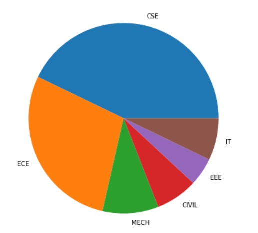
In the above example, we have six departments and the count of students in each department.
The pie chart output shows the distribution of the students in a circle.
The area of the circle is divided according to the percentage of students in the department.
In our example, The department CSE has more students.
The allocation of the area starts from the x-axis and moves towards the anti-clock direction.
We use the function pie to construct the pie chart.
Start Angle Parameter
We use the parameter startangle to change the starting position of the pie chart.
The below example shows the program to change the starting angle of the pie chart.
#Start angle parameter
plt.figure(figsize=(8,7))
plt.pie(studentscount,labels=departments,startangle=45)
plt.show()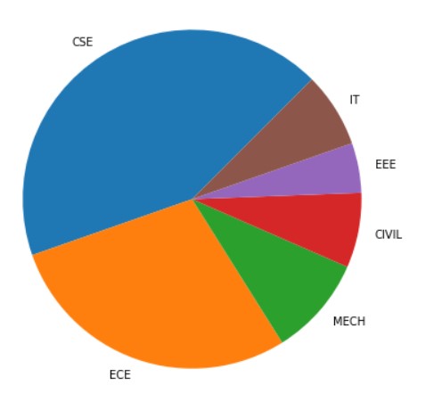
Shadow and Explode Parameter
We use the shadow parameter to show shadow for the pie chart.
We use Explode parameter to differentiate partitions of the pie chart.
The below example shows the program to explode and show shadow to the pie chart.
# shadow, explode parameters
plt.figure(figsize=(8,7))
plt.pie(studentscount,labels=departments,shadow=True,explode=(0.2, 0.1, 0.2, 0.3, 0.2, 0.0))
plt.show()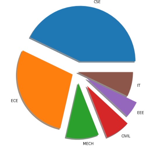
autopct parameter
We use autopct parameter to represent the percentage of proportion.
The parameter autopct will take input a function. the return value of the function is displayed on the partition of the pie chart.
The input to the function is the percentage values.
In our example, we use the lambda function to represent the format.
The below example shows the program using autopct parameter.
#autopct
plt.figure(figsize=(8,7))
plt.pie(studentscount,labels=departments,autopct=lambda pct:"{:.2f}".format(pct))
plt.show()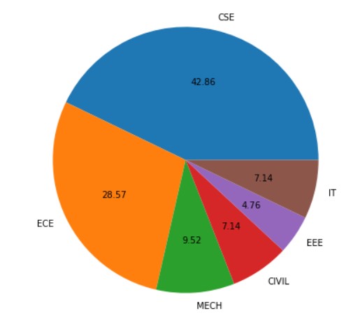
wedgeprops textprops Parameter
We use wedgeprops parameter to modify the properties of wedges.
In our example, we change the line size and color.
We use textprops parameter to modify the text properties.
In our example, we changed the text color.
The below example shows the program using wedgeprops and textprops parameters.
#wedgeprops textprops
plt.figure(figsize=(8,7))
plt.pie(studentscount,labels=departments,wedgeprops={ 'linewidth' : 3, 'edgecolor' : "green" },textprops = dict(color ="red"))
plt.show()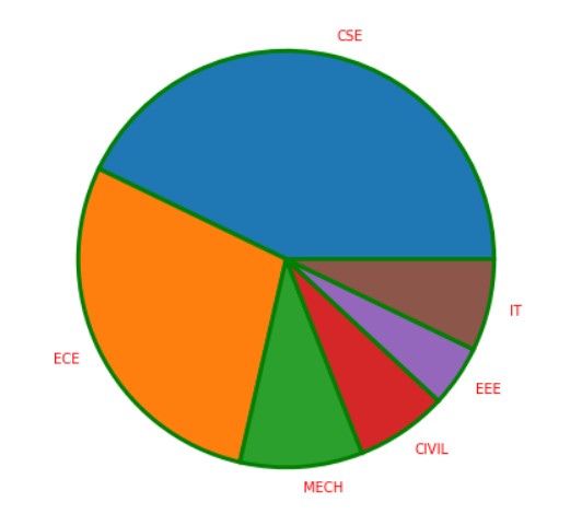
pie Function return Values and Legend
The pie function will return three list objects. They are wedges, texts, and autotexts.
The object autotexts will be returned when the autopct option is available.
The wedges object contains the wedges of the pie chart. We can change the properties of wedges using the methods available with the return object.
The texts object contains the text of the pie chart. We can use the methods of the object texts and modify them.
The below example program shows another way to modify the properties of wedges and texts.
#pie function return and legend
plt.figure(figsize=(8,7))
wedges, texts = plt.pie(studentscount,labels=departments)
plt.legend(wedges,departments)
plt.setp(texts, size = 20, weight ="bold")
plt.show()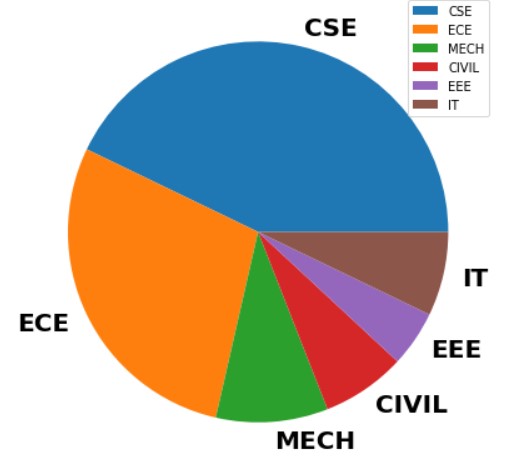
We create a legend by using the wedges object.
We use the method setp to modify the properties of text.
