TreeMap Plotly
In this class, We discuss treemap plotly.
For Complete YouTube Video: Click Here
The reader should have prior knowledge of the superstore data set. Click here.
TreeMap
The treemap displays hierarchical data as a set of nested rectangles.
To construct the treemap. We use the superstore data set.
In the superstore data set, we consider the region, subcategory, and sales.
Group based on region and subcategory. Sum of sales according to the subcategory.
We use the module plotly.express.
From the above module, the function treemap is used to construct the treemap.
The below example shows the program to construct a treemap.
import pandas as pd
df=pd.read_excel('sampledata.xls',sheet_name='Orders')
print(df.head())

import plotly.express as px
fig=px.treemap(df,path=['Region','Sub-Category'],values='Sales')
fig.show()

The data frame is given as the first argument to the function treemap.
The path parameter will take the list of columns considered to the group. Our example, take region and subcategory.
The values parameter will take the column needed to display. Our example take the sales column.
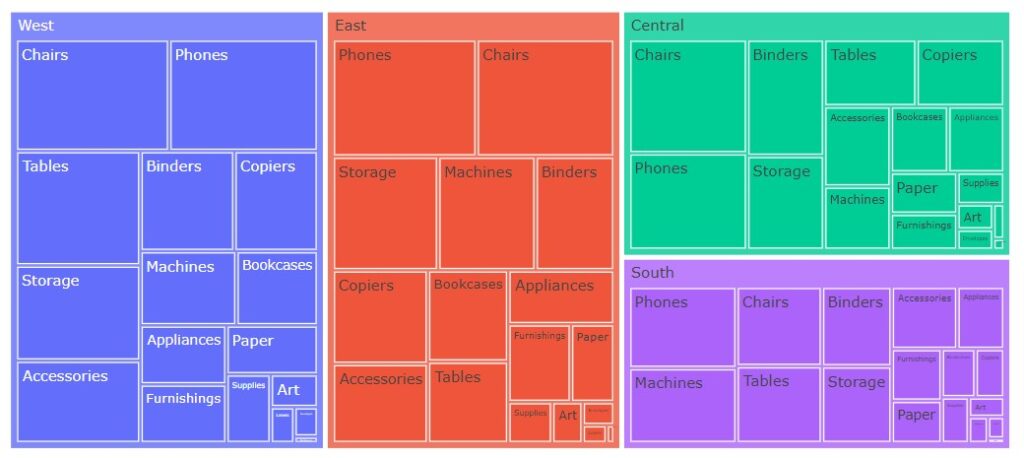
In the above output region, wise hierarchical rectangle boxes are shown.
The region-wise subcategory sales are given in rectangular boxes. The box sizes are based on sales.
root_color and margin
The treemap function will return the treemap object. So we can use the methods available in treemap objects.
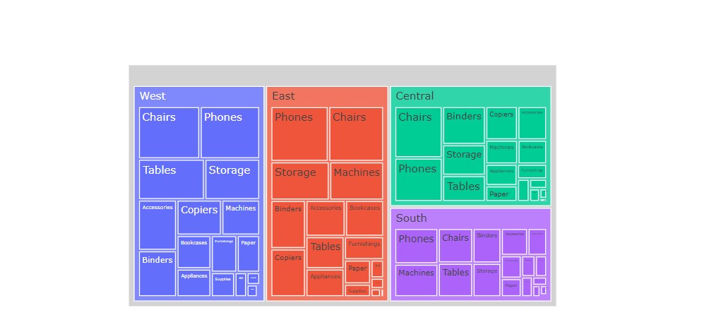
We use the method update_traces to change the root color.
We can change the margin using the method update_layout. The options t is top, l is left, r is right, and b is the bottom margin.
The below example shows the program to change root color and margin.
fig=px.treemap(df,path=['Region','Sub-Category'],values='Sales')
fig.update_traces(root_color="lightgrey")
fig.update_layout(margin = dict(t=250, l=250, r=250, b=2))
fig.show()
Different Colors
The parameter color discrete map takes the dictionary of colors.
The below example shows the program to change chairs’ color to gold, tables color to black, and region color to black.
# giving different colors
fig=px.treemap(df,path=['Region','Sub-Category'],values='Sales',color='Sub-Category',color_discrete_map={ '(?)':'lightgrey','Chairs':'gold', 'Tables':'black'})
fig.update_traces(root_color="black")
fig.show()
